Eye tracking
Usability study for
Engram


Decoding Engram: Unveiling the Secrets and Pitfalls of User Engagement for increased Retention
To enhance the user experience, our team conducted eye-tracking study on Engram's website, focusing on pivotal user flows. This insightful exploration aimed to gather valuable feedback from participants, empowering us to deliver targeted recommendations for substantial improvements to the website's usability.
Overview
Engram, the AP World History platform, offers comprehensive learning with content, quizzes, and practice essays for high school students. Despite its offerings, our focus was drawn to the challenge of user retention, with only around 57.8% of users returning. Thus, our mission was clear: embark on an exploration of Engram's intricacies, employing eye-tracking usability study to get insights that could drive significant enhancements and deliver actionable recommendations, empowering Engram to refine its platform and foster sustained user engagement and retention.
Our testing process involved recruiting participants as per Engram's target demographic and through moderated usability testing, eye tracking, and behavioral analytics, we closely observed participants navigating Engram's educational platform. Using methods like Retrospective Think Aloud and gaze replays, we gained valuable insights into user experiences and thought processes. Conducting 6 sessions, we identified key findings and areas for improvement, providing a roadmap to enhance Engram's overall user experience.
Overall the study results revealed that participants perceived the Engram website as having valuable content and features, yet there's room for improvement in terms of clarity and engagement. Enhancements in language, guidance, and overall consistency have the potential to elevate Engram's user experience, ultimately fostering increased engagement and user satisfaction. Our team distilled these insights into 11 recommendations, addressing six key findings.
A quick dive into the study results

Visual Summary of the findings and recommendations
METHOD Eye Tracking study
PRODUCT TYPE Website (Only Desktop)
CLIENT Engram
TIMELINE September - December 2023
TEAM Priyanka Jain (me) Becky Su Mary Haws
MY ROLE UX Researcher
TOOLS USED GA4, Hotjar, Zoom, Figma, Tobii Pro Lab
Target Audience for the study
Kick-off Meeting: Elevating User Retention and Engagement for Engram
Our journey with Engram commenced in a collaborative setting, where the client mentioned that they aimed to increase user returns, foster deeper exploration of site features, and transform Engram into an engaging AP World History tool. The meeting unveiled the client's vision and future plans, providing a roadmap for our study. Our mission was clear: delve into current user engagement on Engram and propose enhancements to make the platform more effective and engaging.

Meeting the client
Enrolled in AP World , US or European History
18+ years old
Residing in NYC
Motivated to learn AP history
Capture user’s behaviors, thoughts, and feelings
Understand existing engagement
Make recommendations to help increase retention
Project Goal
Post our kickoff meeting with Engram, where we aligned on project goals, we embarked on a thorough exploration of user behavior by looking at the Google analytics and Hotjar data. We meticulously analyzed user behavior which layed the groundwork as we designed moderated usability tests with eye-tracking to gain deeper insights into user engagement. Our primary goal was clear - to understand user interactions with Engram and identify opportunities for enhancing retention.
Crafting a Roadmap from Behavioral Analytics to Eye-Tracking Study
Upon diving into Engram's user data eye catching insights emerged—the essay-writing section, designed for practicing Long Essay Questions (LEQs), was a bustling hub. It had the highest user engagement, attracting more sessions than any other page on the website. However, even though it was a hotspot, this page witnessed the highest number of abrupt exits, with 31% of users leaving. This raised a red flag, hinting at potential user confusion surrounding the contents of the essay-writing page.
1. LEQ Essay page: Examining User Attention versus User Departure
The "Get Started" button, positioned as Engram's primary call-to-action on the homepage, stood out as the third most-clicked button overall, capturing the attention of users in 55% of sessions as per data acquired from Hotjar. However, the twist in the tale lay in where this button led—straight to the essay-writing page, where the abrupt exits were around 31%. This unexpected transition raised concerns about potential confusion, as participants might have anticipated a different destination on clicking "Get Started."

Data from Hotjar
2. “Get Started”: Attracting Users Visually, Leading to Unexpected pages

Data from Hotjar
Creating Tasks to uncover user expectations and behaviors
To understand the high engagement and potential confusion surrounding the LEQ essay page, we crafted 2 tasks where participants explored various difficulty levels of essays on LEQ essay wirting page and then also navigated to feedback page.
The Tasks
You have just started to prepare for the long essay section of the AP World History exam. Complete a sample essay, then review Engram’s feedback for your thesis statement (you can type anything into the essay fields).
Now you want to practice long essays more formally. Complete a real College Board essay, then review Engram’s feedback for your conclusion (Can type anything into the essay fields).
Building on the collective insights of the client and our team, participants weren't assigned a direct task regarding the "Get Started" button. Instead, we wanted to observe their actions closely during testing, using retrospective think-aloud sessions. This helped uncover participants' expectations, validating or disproving our hypothesis and addressing potential confusion linked to the 'Get started’ and ‘LEQ essay writing’ page.
Why did you click on the Get Started button? What did you expect?
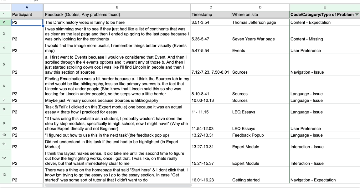
Thematic Data Analysis based on gaze plots and RTA
Participant demographic
Tailoring a Screening Questionnaire to Engram's Audience Criteria
Upon working on the tasks based on the data gathered from client meeting and behavioral analytics, the focus shifted to assembling a diverse participant pool. Our screening questionnaire meticulously identified individuals aligning with Engram's target audience:
Enrolled in AP World, US, or European History
18+ Years Old
Residing in NYC
Motivated to Learn AP History
To understand how motivated participants were to learn from an AP history website, we faced the challenge of finding a clear measure since it can be subjective. So, we directly inquired, "How motivated are/were you to learn the material in your AP history course and/or improve your score?" in our screening questionnaire which helped us get the information we needed.
Navigating recruitment
With this groundwork, our next challenge emerged in recruiting participants. Initially reaching out to undergraduate students via email and social media yielded low interest, leading to an adaptive recruitment strategy. We also used the guerrilla-style approach, we engaged with students on campus, attending classes, approaching professors, and finally widening the age criteria to below 26. This shift allowed us to assemble 6 participants with diverse motivation levels for our eye tracking usability testing.
To overcome this setback, we streamlined our analysis process, emphasizing a focused examination of task performance, qualitative data, and eye-tracking insights through tools like heatmaps, gaze plots, and retrospective thinking. The integration of the System Usability Scale, post-task ratings, and data from Google Analytics and Hotjar optimized our strategy, allowing us to extract valuable insights despite the limited timeframe.


Navigating Recruitment Challenges: Adapting and Optimizing
Our recruitment process faced obstacles due to the age constraint initially set at 18-22. To address this, we adjusted the age criterion to below 26, expanding our participant pool. However, this adaptation resulted in a time loss of approximately 2 weeks from our original analysis schedule.
Turning Setbacks into Opportunities: Efficient Analysis in Limited Time
Transitioning to our findings and recommendations: Our analysis pinpointed crucial insights into Engram's user experience. We'll now address specific areas for improvement, offering actionable recommendations to enhance the educational platform.
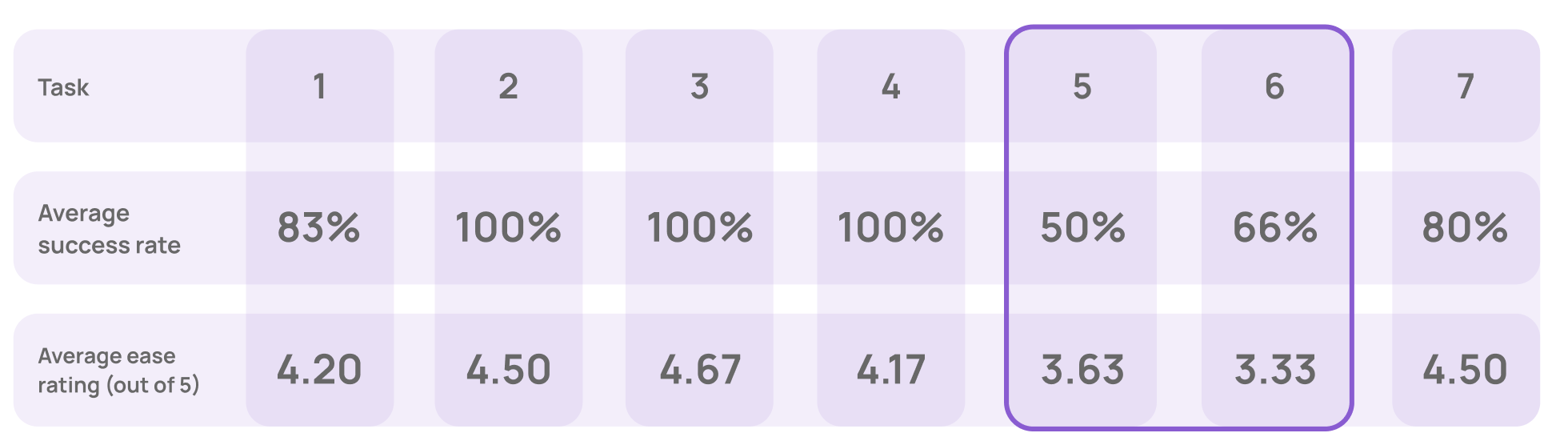
The essay-writing tasks had the lowest success and ease ratings as compared to all tasks. This posed significant implications for the overall user experience, suggesting a need for targeted improvements to enhance user success and satisfaction.
Comparing task success rate and ease rating across tasks
Insufficient Guidance Hinders User Engagement with Engram's Essay Features
Finding 1
Participants struggled to choose between essay modules
4 of 6 participants completed the wrong type of module for at least one of the essay tasks, because the description of the modules or button labels was unclear and led to confusion.
One of the participant struggling to choose the right essay module
I already filled out the pick-up notes, so I’m not sure why this pop-up appeared.”
“
PARTICIPANT QUOTES
This confusion is also reflected in the high u-turn rate of 31% on the essay page. Additionally, a closer look at user behavior shows that the essay page has the longest average engagement time of 2 min & 12 sec on Engram as per data gathered from hotjar and google analytics respectively.

Recommendation 1
To address this confusion we propose enhancing clarity in essay modules by introducing clear steps to first "Learn Writing," and then "Practice Writing". Grouping the three modules under Practice writing with detailed descriptions and adopting consistent button labels would allow them to appear as the same type of feature but still with varying difficulty levels.
Participants struggled to choose between essay modules
Essay writing page

Engram’s Google Analytics

Proposed solution for LEQ page

Essay page - self identify for feedback
One participant who figured out how to use the self identity feature
Finding 2
Most participants missed self-identifying their essay sections for feedback
Only 1 out of 6 participants successfully navigated the self-identity feature. While this participant found it intriguing, they encountered challenges in accessing it. Other participants didn’t seem to notice this feature at all.
First I was just clicking on the sections and then I realized I had to highlight them, because that wasn’t clear until I actually did the highlighting.
So maybe something about how you actually do this task, about highlighting the sections, would have made it clearer.”
“
PARTICIPANT QUOTES
Recommendation 2
We suggest enhancing the discoverability of the self-identification feature within the essay sections, as 5 out of 6 participants did not notice this functionality. To do so we have recommended providing more detailed instructions above the essay fields. Additionally, ensuring that highlight swatches are consistently visible, avoiding the need for a click to reveal them and preventing obstruction of text in the essay field. Also anchoring these swatches to the side, such as the left side of the essay field, would allow users to scroll through their essay while maintaining easy access to all available colors.
Make the essay self-identification step more discoverable.

Proposed solution for self-identification

Gaze heatmap from Tobii
Automated feedback after clicking ‘Submit’
Finding 3
The feedback button is visible yet also hidden in a pop-up modal
Even though participants noticed the "Feedback" button in the pop-up as shown in the gaze heatmap alongside, they didn't quite get how to use it.
3 out of 6 people missed checking their feedback for at least one of the two essay tasks, and in 57% of essay submissions, users didn't check their feedback(as per hotjar). This suggests that the "Feedback" button isn't standing out enough, making users not click on it as much as we'd like.
Recommendation 3
Making the feedback button more discoverable and accessible
We suggest improving the discoverability of feedback by eliminating the pop-up and instead directing users straight to the feedback. Introducing a loading screen with graphics and language similar to the pop-up can provide context, informing users about the feedback process. Ensuring this process is automatic will guarantee that users consistently receive value and stay engaged with their feedback.

One participant on their misalignment with “Get Started”
Both the client and our team were eager to learn what users think about the 'Get Started' button since it is a primary button on the homepage. We wanted to know how users use it and what they expect from it. This curiosity was driven by the shared goal of making sure the button aligns well with what users need and want.
Finding 4
Making the feedback button more discoverable and accessible
The "Get Started" button, draws a lot of attention with its visibility on the homepage. Despite being easily noticeable, it falls short in meeting users' anticipated actions. This disconnect is underscored by the fact that 4 out of 6 participants mistakenly clicked "Get Started" which goes to the essay page instead of navigating to history topics. This further emphasizes the need to reassess the button's role to ensure it aligns better with user expectations.
“
Solution 1:
Gaze heatmap from Tobii
“Get Started” does not align with user expectations
I didn’t really look at the top; my eye first went to “Get started” and I didn’t know it would specifically lead to essay writing.
PARTICIPANT QUOTES
Participant expectations of “Get Started”
Based on these experiences and interactions we tried to understand what participants expected from 'Get Started’.
Expected to see create an account
Expected some sort of tutorial or guide for the website
Expected to see a history topic page
Recommendation 4
Participant expectations of “Get Started”
We propose two different solutions for the call-to-action button, each catering to different developmental directions for Engram.
Aligning the call-to-action label with its current function, directing users to the essay-writing section. This adjustment would minimize user confusion and serve as a prompt solution, particularly suitable if Engram prioritizes essay-writing.
Solution 2:
The alternative approach is to keep the existing label, "Get Started," but redirect users to a page offering guidelines or an introduction about Engram and how to use the website. This recommendation comes from the user feedback regarding their expectations for the "Get Started" feature.


‘Get Started’ changed to ‘Practice Essays’

Get Started leading to a new page
Influencing Growth: Insights and Impact on the client
Our study's outcomes triggered discussions on shaping Engram's growth trajectory. Through a comprehensive slide deck report, we effectively communicated usability metrics, findings, and recommendations to the client. We came up with 11 recommendations with accompanying mockups and a list of 15 identified problems.
This highlighted some of the gut feelings of confusion that I felt, but I didn't know how, or what, or even how to fix it.”
“
CLIENT
The positive reactions from the client led to deeper discussions about the future of Engram. They are now planning to make changes based on our recommendations to enhance their tools. In crafting our recommendations, our ultimate goal was to boost retention rates and enhance user engagement for Engram.